Why I Redesigned My Website
- pavethra
- Sep 30, 2021
- 3 min read
When I first launched my website, I remember a rush of energy swift through me as I hit the "publish" button and watched the images I had once moved freely sit still. As I checked my first blog post for any technical difficulties, I noticed how the practise of rereading the text granted the words to be engraved and become easily recitable. While I was impatient to hear how the words and images were soaked up by someone else, I tried to embrace what I could write and the design for what it looked like.
Over the past year, I started to mentally note any attributes of my website that unmatched my identity and did not harmonise with the rest of the site. I allowed for subtle changes. Yet my gut was yearning for change greater than the number of blog posts on the home page and the addition of a photography page. At this point, I became conscious of how the mental, scattered notes needed to exist outside my mind.
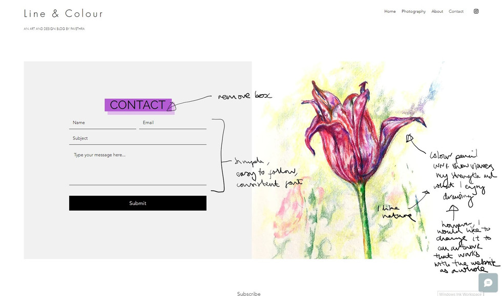
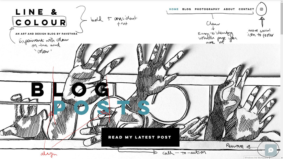
To translate my thoughts onto a page, I allowed myself half-hour to navigate the site and jot any elements I grew fond of or felt eager to change. While I was aware that the prime goal was to improve my website, it is important that I could recognise the characteristics that do work - no matter how small. Whether it is the white space around the images or the minimalistic font, the practice of identifying the good in a design will prevent me from tearing my ideas or someone else's completely.
I hope you can get a glimpse of my thoughts from the annotations below. Apologies for the terrible handwriting!
While the exercise of scribbling notes was simplistic, I was quick to learn that I enjoy incorporating white space and flat colours. Not only do they stop the website from becoming overwhelming, but it also draws attention to the artwork, buttons and links which then encourages the viewer to navigate the site. To expand on this exercise, I looked at different blog sites and reached for tips online. This method allowed me to recognise key aspects in web design; some of which include:
- Using the home page to set the tone for the rest of the website
- Consistent colour palette
- Clean-cut imagery
- Remove social media feeds on the website
- Text that is easy to digest
Within my research for improved web design, I stumbled upon Hick's law. The law states the relationship between multiple options and the time taken to make a decision. The finding that when we are presented with many options, we take longer to decide seemed obvious. Yet, it encouraged me to see the challenge between being specific and overcomplicating a design. I learnt that Hick's law does not aim to eliminate the decision-making process but simplifies it. I recognised how I could apply this relationship to the new addition of commission forms to my website.
With the advice and annotations at hand, I went ahead with changing the layout, images, and colour palette. I noticed how I had not even included my favourite colour within the design. To rectify this, I started experimenting with blue and how it can be combined with black and grey for contrast and clarity against images.
To evaluate my design, I returned to annotating. Before this, I allowed for a few days away from the website altogether as I was keen to have a fresh outlook towards the developed website.
Where I was intrigued by the improvements I had noted, I recognised how the design decisions are governed by my opinions and for feedback on the user experience I needed to reach out to my friends and family. As I spoke to each individual, I was surprised by their feedback on the choice of words, layout and content. Their questions on why I had chosen to rearrange images a specific way and the next steps on my artwork and photography motivated me to understand my work and direction better.
As opposed to me listing out the further changes, see if you can spot them on the live website!
Much like the first time I launched my website, I knew that I could spend more time editing and researching tips. However, I was conscious of the dangers of thriving for perfection and how that would stop me from continually sharing my work. With feelings of content and appreciation filling inside me, I clicked the publish button.
I am aware that perhaps over the next few weeks or months, I will identify an element that is not working, a new idea or gather advice from you. It will require me to make more changes - but isn't that what growth is?
If you have any feedback, let me know in the comments - I would love to hear from you!










Comments