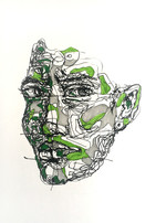
To improve my portraits, I have recently incorporated a drawing exercise into my daily routine. I can already see that I am moving away from the idea of perfection and willing to experiment to with felt tip pens and fine liners - mediums which I know I have been reluctant to try. It was the thought of not being able to erase anything that made me feel anxious about using these mediums. But with these drawing exercises, I have got myself into routine - where if I produce something that I don't like, I'll find a way to change it or I'll just try again.
Over the past two weeks, I have been focusing on left-handed drawings as I wanted to see how these will vary from my blind drawings. In my previous blog post, I mentioned about wanting to experiment with different facial expressions - so I decided to combine the two! I was not exactly sure what the outcomes would look like and this uncertainty is what encouraged me to go ahead with this drawing exercise.
Within these drawings, I applied patches of bold colour. This was to help me explore the relationship between colour and facial expressions. I could immediately see how not only does the blocks of colour add to the abstract element of the drawing but they emphasise how the features appear to change size with each facial expression. For instance, in the drawing below, the areas of yellow under the eyes and on the chin emphasise how the eyes close tight and the mouth opens wide when you yawn.

The method of incorporating colour encouraged me to look into the concept of colour psychology. This concept identifies to how colours can influence emotions, cause certain reactions and impact our decisions - from the things we buy to deciding the food we want to try. Interestingly, we may be unaware that colour influences our decisions in simple tasks. This idea of colour having qualities that can cause reactions motivated me to produce more left-handed drawings with colour.
Now, deciding the colour for the facial expression I had drawn wasn't as easy as I had thought. I used multiple websites to understand the representation of colours and I found that they have different associations in different cultures. I spent some time writing out the colours and their associations. If you're a bit like me, I like to write things down to help me clear my thoughts - so this writing process helped me realise something important.
I was able to understand how one colour has the ability to evoke emotions that are at different ends of a spectrum. For example, red can cause feelings of warmth, love and energy, whilst also having associations with anger and danger. So, deciding on a colour for the left handed drawings didn't have to be as complicated as I had made it out to be. I simply picked a colour that I associated with the facial expression. For instance, the drawing at the top of the page illustrates laughter and someone may have decided to incorporate patches of yellow - as it is linked to feelings of happiness - but to me, I felt that the bright pink had some sort of crazy element that could elevate the facial expression.
What colour/colours would you have picked?

When it came to deciding where to apply areas of colour, it was both an experimental and observational process. I used the reference images and applied colour to where light falls onto the face. The drawing above incorporates 3 shades of blue to demonstrate light and dark tones. This process allowed me to see how light is likely to fall on the tip of the nose, on the forehead and cheeks.
By experimenting with both blind and left-handed drawings, I have been able to produce very different outcomes. With blind drawings, the word 'free' comes to mind as you are just letting your pen wonder and the disproportionate features say that it's ok not to have a 'perfect' drawing. With left-handed drawings, I had more control. I was able to incorporate shapes to demonstrate the structure of the face. The downside is that sometimes you find yourself focusing on the way you are awkwardly holding the pen and not the reference image - but having said this, over the 2 weeks I did get better at staying focused on the image and I managed to produce better outcomes!
I look at these drawings against my colour pencil portraits and they almost look like they have been done by two different people - but I guess that's the beauty of this - I can produce very different outcomes, whilst implementing my favourite elements such as colour and shapes.
I'd like to develop these drawings into patterns - think it'll be quite interesting to see what they would look like together. I have also been thinking about overlapping words onto these drawings, what are your thoughts on this?
Here's a short animation of one of my left-handed drawings. Hope it gives you an idea of how I went about these drawings! Let me know if you prefer my blind or left-handed drawings or both :)


Comments